
Parking Validation Redesign
Helping drivers validate their parking and know when they’re done.
A long queue at a parking validation machine made me pay closer attention to the experience. People were taking time to enter their registration, but some also stayed after their parking had been validated.
When it was my turn, I noticed moments where the interface left me questioning what to do next, and whether it was successful.
More demand, but unnecessary hesitation.
One of the car park’s validation machines was out of service, so customers were being directed to the remaining machine.
Increased friction, with added hesitation.
There was additional demand with one of the machines out of order.
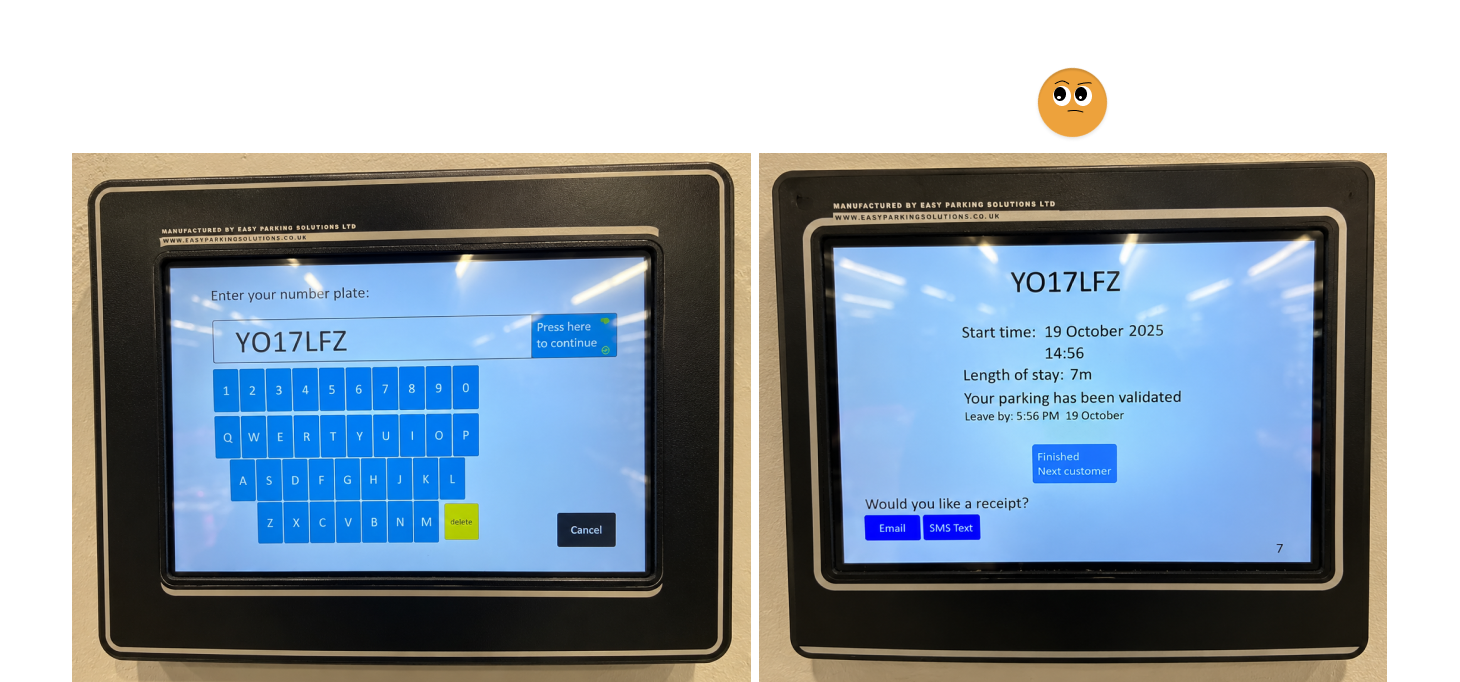
But my observations suggested the interface was adding friction: touch input felt delayed, registration suggestions were easy to miss, and the success message competed with parking details and receipt options.
I used these observations to explore a simple hypothesis…
Clearer feedback and confirmation could help people complete the task with less hesitation.
What the user currently interacts with.
Make the next action clear.
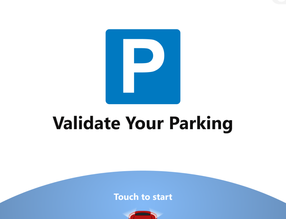
Start screen
The opening screen gives the machine a clearer purpose, with a prominent instruction to start and the location displayed for reassurance.

A familiar UI and clearer entry.
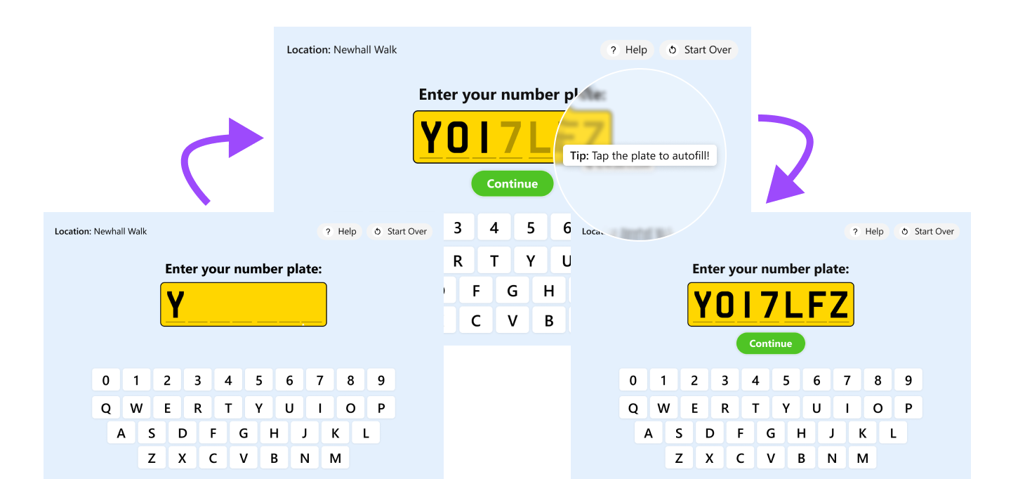
A familiar number plate UI makes entering the registration the focus. I separated entered and suggested characters, added an instruction for accepting the suggestion, and positioned Continue directly beneath the plate once the entry is ready to proceed.
Dark characters on light keys and more space between controls are intended to make the keyboard easier to read and use.
Informing the user they can tap to auto-fill.
Smaller improvements to think about.
Options for Help and Start Over remain consistently placed, giving people a route to support or a fresh start.
Subtle animation supports the transitions without carrying essential information.
Visual feedback could acknowledge a touch, although resolving the original input delay would require investigation beyond the interface.
Reassurance introduced another step.
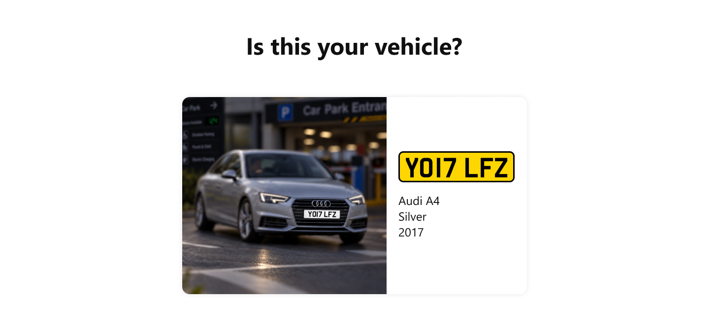
I explored a vehicle confirmation screen to help people catch an incorrect registration before validating it.
Does the reassurance justify another interaction?
Showing the vehicle could provide reassurance, but it also adds an interaction. I would test whether the reduction in mistakes justifies that extra step. Vehicle imagery and identifying details would also depend on what the parking system can provide.
Make it obvious when the task is complete.
Improved hierarchy and visual confidence.
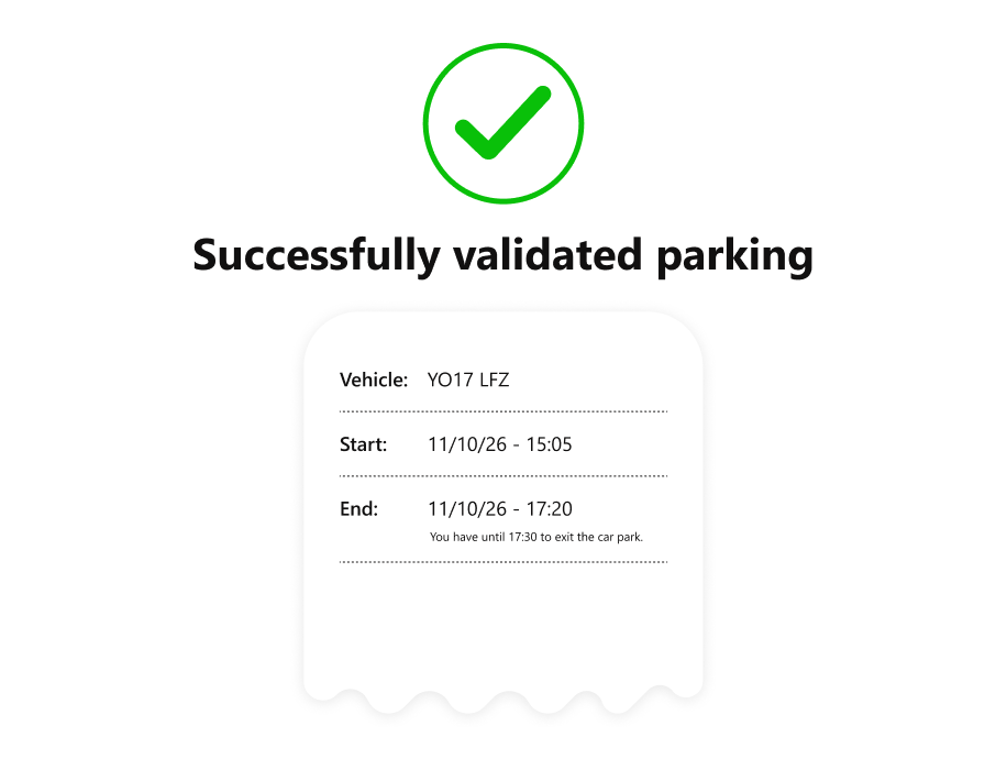
The redesigned final screen prioritises the success message, supported by an animated tick. Parking details sit beneath it, with receipt options as secondary actions.
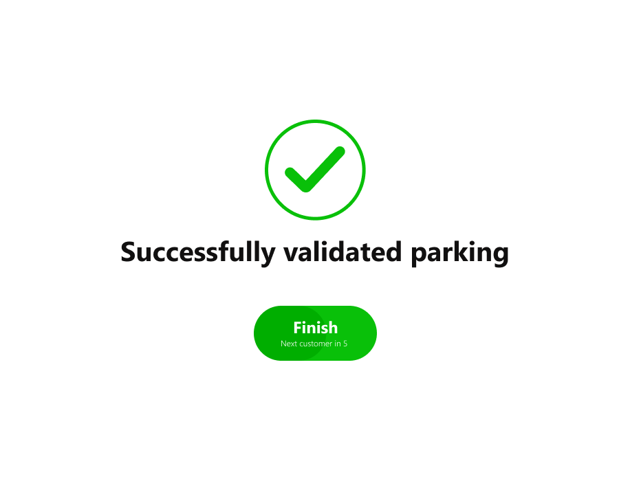
A Finish button and automatic reset support the handover to the next customer. The timing would need testing so customers can check their details or request a receipt without feeling rushed.
From paper to prototype
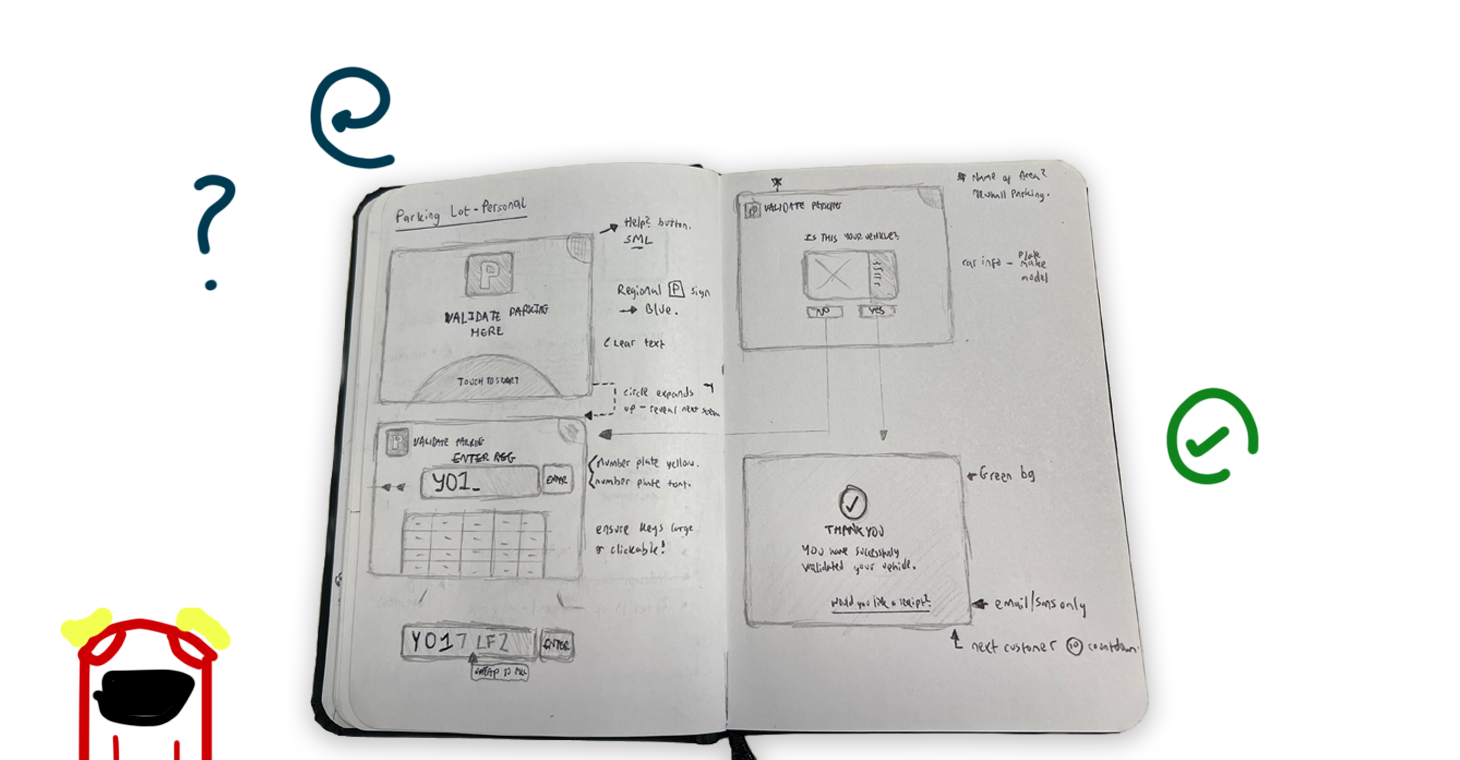
This is an untested concept, so I cannot claim it reduces completion time or queues.
I would compare registration entry time, mistakes, use of suggestions and time spent at the machine after successful validation. That would establish whether the redesign improves efficiency as well as clarity.
What I took from it
Users need to feel confident.
The task hasn’t finished just because the system has processed it. People need to understand the outcome and feel confident moving on.
Equally, every extra step needs a reason. The aim is to remove uncertainty without adding unnecessary interaction.