At a glance
- Company
- TopCashback
- Role
- Lead UX/UI Designer
- Duration
- 6 weeks
- Platform
- Website
- Tools
- Figma, Miro, Adobe Suite, HTML/CSS, Convert (A/B Test)
Redesigned the payout success page to create a more rewarding moment, while testing and iterating to significantly increase post-payout engagement.
The Payout Success screen is where users land after successfully withdrawing their cashback. It’s a positive moment in the journey, so I saw an opportunity to make the experience feel more rewarding through a refreshed layout, and bringing out the brand’s personality.
Alongside improving the experience, I wanted to understand how these changes affected user behaviour. The page also drives significant traffic to Trustpilot and Refer & Earn, so it was important that the redesign didn’t negatively impact these journeys.
I led the end-to-end UX/UI Design for this project across the website, my key responsibilities included:
The existing page hadn’t been revisited for several years and felt underwhelming for what should be one of the most positive moments in the TopCashback journey. The page also serves a secondary purpose, users can leave a Trustpilot review or refer a friend after completing their payout, and both links receive significant traffic.
This project wasn’t purely a visual refresh. I aimed to create a more engaging and positive experience without negatively affecting other existing journeys - if anything ideally improve performance.
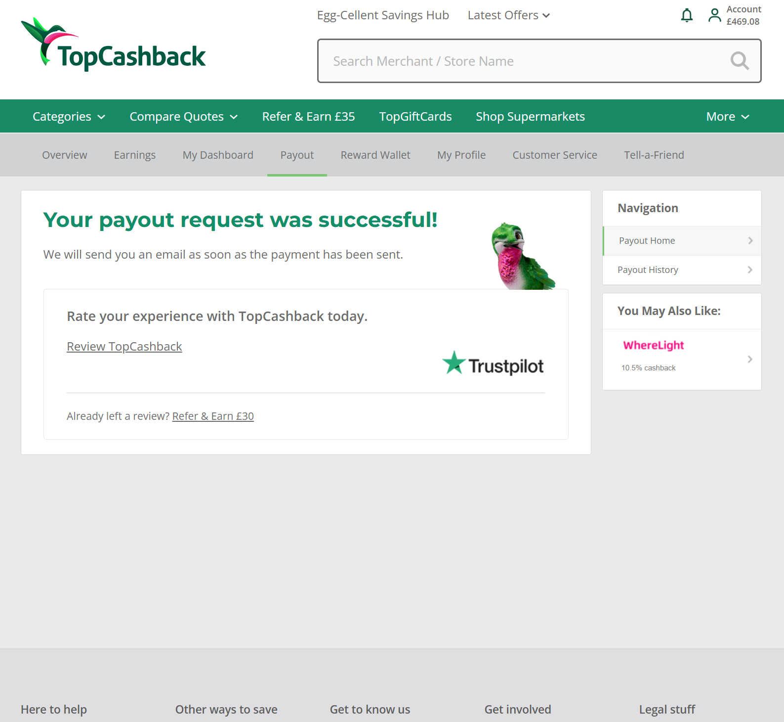
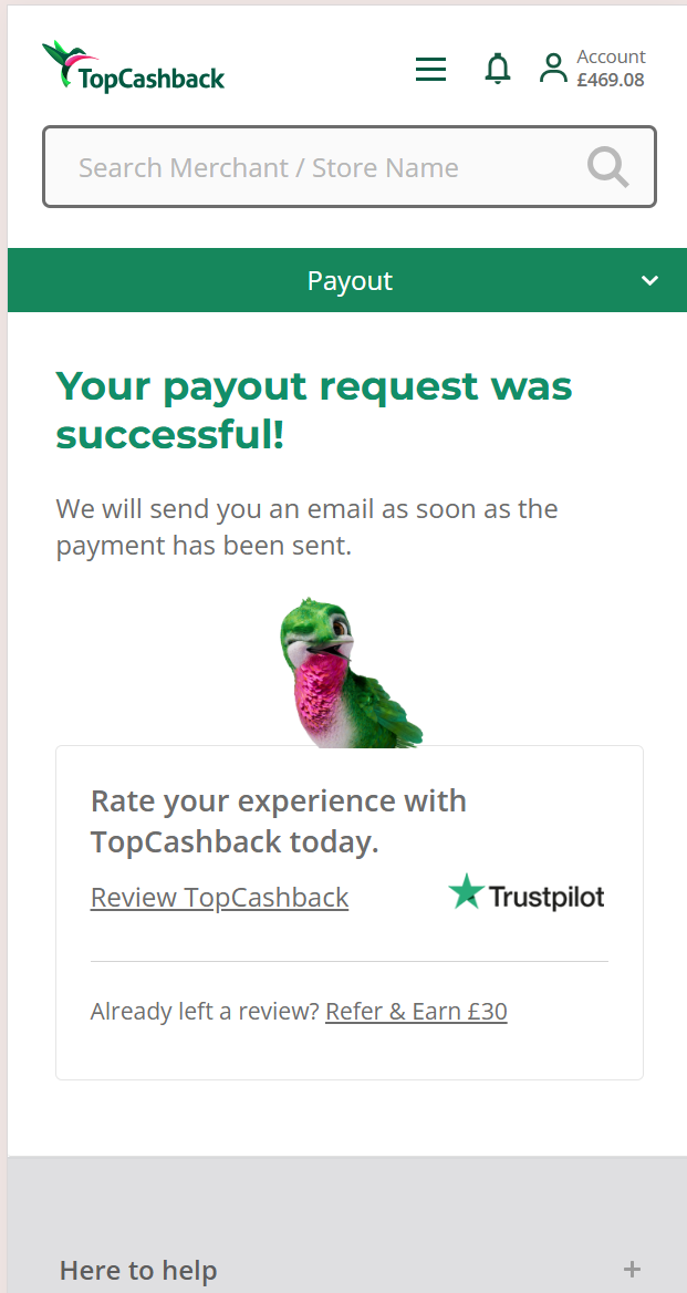
I explored several approaches for the layout and considered how elements such as the TopCashback bird, confetti and animation could introduce more personality without distracting from the core goal of this page.
The hierarchy remained simple, the primary goal was to clearly reassure users that their payout had been successful. Everything else (referring a friend, leaving a review or viewing payout history) was secondary.
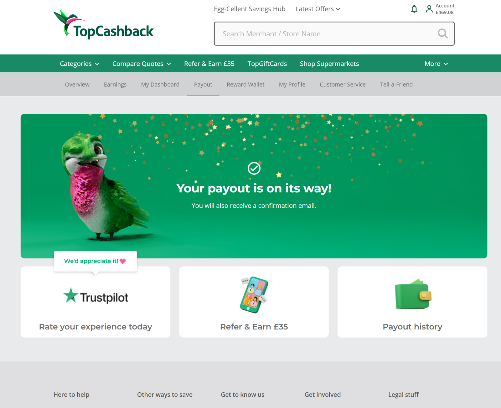
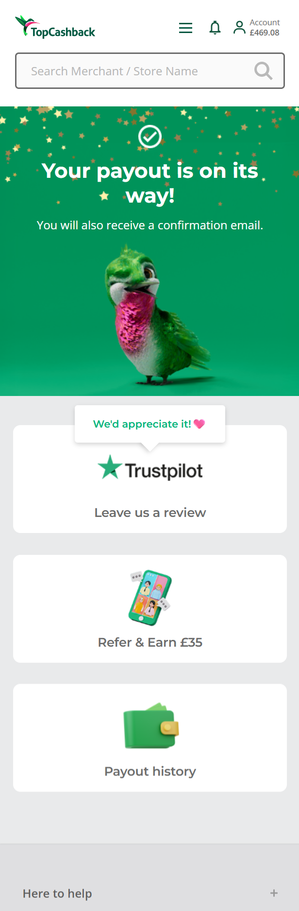
With that in mind, I explored a bento-style layout made up of four sections, one larger panel for the payout confirmation, supported by three smaller panels for the secondary actions. This gave the success message clear visual priority while allowing each secondary action to have its own space, rather than competing with the main message.
I ran an A/B split test comparing the new design against the existing Payout Success page.
The results differed between desktop and mobile. On desktop, Trustpilot clicks decreased slightly, while Refer & Earn increased and Payout History saw a significant increase. On mobile, all three secondary journeys saw notable increases in clicks. This was particularly important because mobile accounted for more than 70% of traffic to the page, meaning its performance had a much greater influence on the overall result
The increase in Payout History engagement made me think that, just because users were clicking it, did it actually belong here? After reviewing the journey and discussing it with stakeholders, we agreed that Payout History wasn’t relevant at this point and was better suited to somewhere within the account area. This was removed and retested on the revised design.
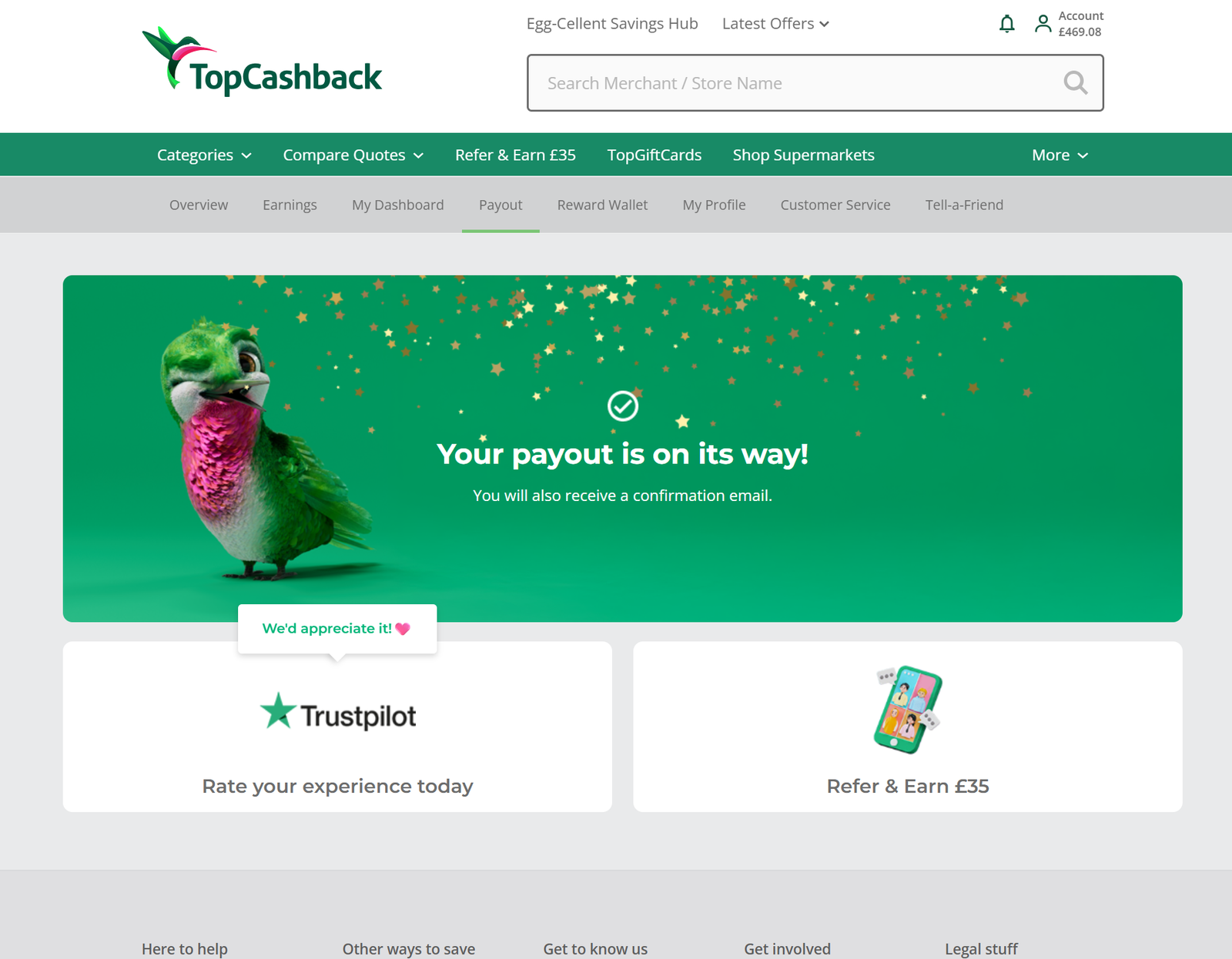
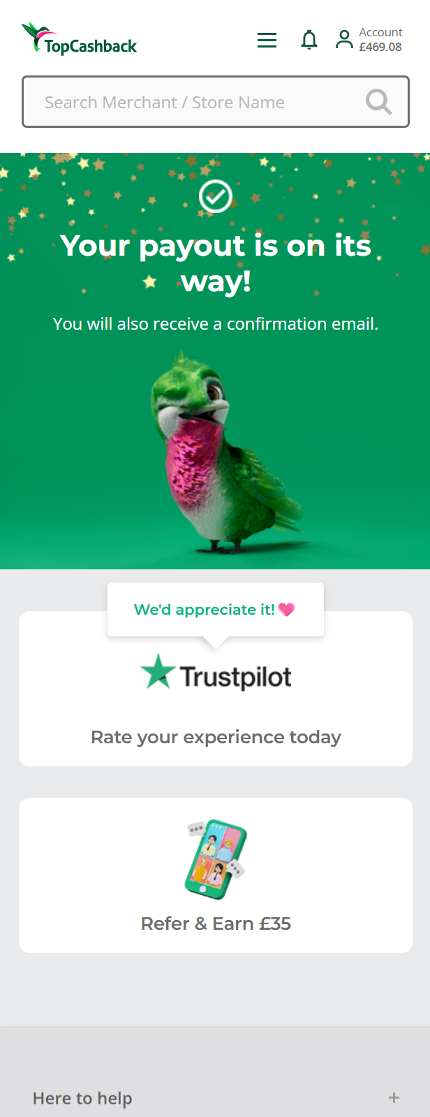
The final design created a much more positive and celebratory experience while maintaining a clear hierarchy. The payout confirmation remained the focus, with Refer & Earn and Trustpilot positioned underneath were clear supporting options, reducing overall cognitive load.
I also revisited the messaging to make it feel more immediate and human. “Your payout is on its way!” better reflects the fact that the payout has already been actioned, whilst “You will also receive a confirmation email” gives users reassurance that the details are being sent to them straight away.
I also introduced some further UI improvements, such as animated confetti, 3D icons - consistent with other areas of the site and app. I also added a delayed prompt to the Trustpilot panel, showing appreciation to users for considering leaving a review without it being too much of a distraction.
I was the sole UX/UI Designer on the project, communicating closely with Marketing to understand and measure the impact of changing the positioning of Trustpilot and Refer & Earn options.
As this page receives significant daily traffic, even relatively small changes could have a meaningful impact. This meant there was strong stakeholder interest in the experiment, including from international teams.
I shared the results throughout testing, using the data from each iteration to explain the design decisions and build confidence in the final approach. Following launch, it was continually monitored to ensure the improvements seen during testing were sustained.
The final A/B test showed a strong overall improvement in engagement.
The results on the final test show that despite a small dip on desktop TrustPilot (TP), the strong gains on mobile (which had over 70% of total traffic) led to a very positive combined performance across both channels.
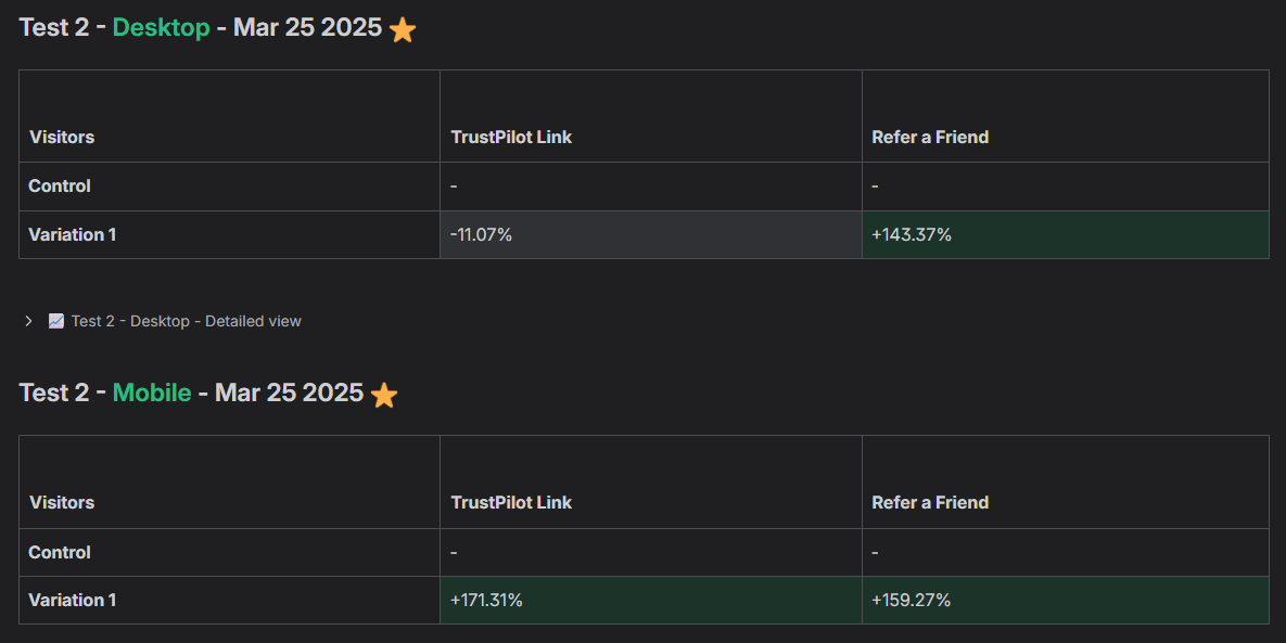
When desktop and mobile results were combined and weighted by traffic, Trustpilot saw a +118.89% overall change, while Refer & Earn increased by +154.66%.
The redesign achieved both sides of the original goal, creating a more positive and engaging end to the payout journey, whilst significantly increasing engagement with the secondary actions.